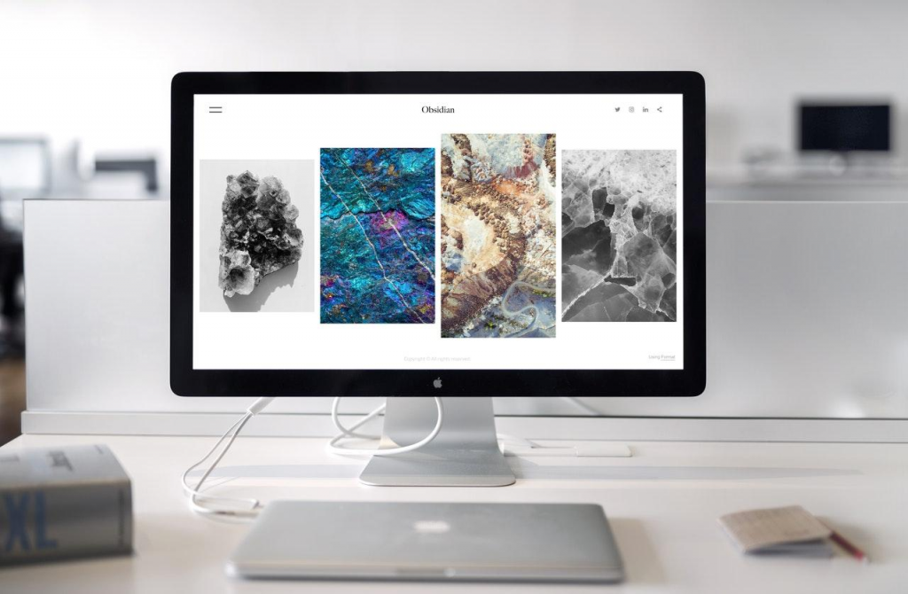
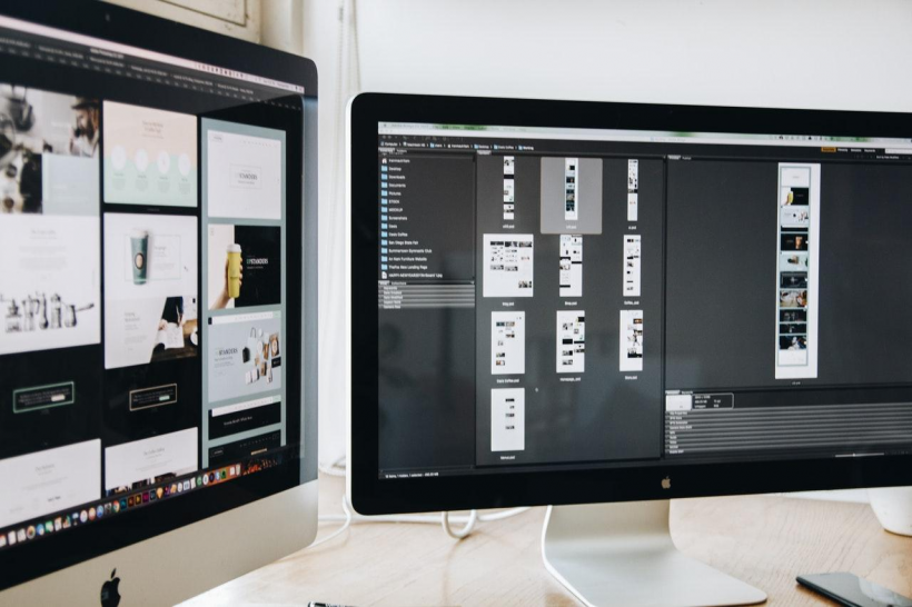
In recent years, minimalist web design has been one of the favourites among web designers as it allows them to create cleaner and more elegant compositions that keep visitor’s attention on the most significant content.
Although it provides web designers with a simple yet clean layout, the job of making these designs isn’t always easy. There are things that you need to uncover to make a successful minimalist web design such as plenty of white space, clarity of purpose, effective colour and contrasts, appropriate typography, clear focal point, etc.,
Web Users and Websites
Web users are particularly drawn to websites with a simple design. They are becoming more cognizant of a website’s usability, which is why they prefer designs that concentrate on essential components.
Additionally, minimalistic design can provide your site with a greater aesthetic appeal. Improved usability will boost user engagement, which delivers the best results. If you can’t do it yourself, asking for some help from affordable web design companies in Toronto or Vancouver is always a smart move.
To know more about the wonders of minimalism in web design, this post will help you get started. We’ve also provided you with the top 10 examples you can check on!
What Does It Mean to Have a Minimalist Design for Your Website?
A minimalist website places premium effort on simplicity, which is avoiding design features that are unrelated to a positive user experience.
Choosing a simple web design with a more colourful design does not imply that you should remove all content and exaggerate your site. Rather, the heart of web design minimalism is emphasizing aspects that are crucial to your users.
How Does Minimalism Impact Web Design?
If you want to simplify your entire user experience, a minimalist approach can elevate your web design.
Minimalist web design allows your site to establish your most essential elements. So, when there are components that no longer serve a purpose or don’t assist users with their tasks, in any manner, it should be removed.
This way, the user experience will be substantially simplified and online user interaction is improved. In return, minimalist focuses on the user experience and assisting web designers to achieve simplicity while keeping the attention of users to explore the site.
3 Things to Consider for a Successful Minimalist Web Design
Developing a minimalist web design strategy requires 3 key areas:
1. Visual elements
Ensure all details to include are significant, functional, and purposeful. From graphic elements, images, videos, images, and words, to background images.
2. Colours and contrasts
Use colours wisely in using minimalist style. Colours should grab the user’s interest without using extra materials or visuals. White is also a great contrast to use for other page elements.
3. White space
This can be used to ensure the user’s attention is kept and guided to your key content. It also helps your site to be clutter-free visually.
Top 10 Amazing Minimalist Web Design Examples

Whether you want a minimalist web design for your pioneering puppy daycare facility in Etobicoke or expert childcare centre services, we have 10 great sites using minimal web designs that you can check out. Get inspired and learn more about some of the hottest minimalist web designs from these sites below:
1. Nuvo
A Canadian lifestyle publication whose website is very simple and straightforward. It has a large number of photos (just like other magazines) while the design and layout are pretty basic without any other visual elements.
2. Ginza
The website for Ginza restaurant is a great example of web design minimalism. The site is organized into short texts and photos of working chefs out in paragraphs, which makes the entire web design clean and succinct. This design also contributes to the overall look and feel of the site, which is vital for a minimalist website.
3. Frankly Steve
A simple and elegant website design with asymmetrical and harmonious block structure. Sections are framed with intricate thin lines with a monochrome colour palette that definitely grabs the user’s attention.
4. Eric Snowden
Eric Paul Snowden, Vice President of Design at Adobe, has a lovely, simple aesthetic on his personal website. His site features a portfolio of his work on the homepage and a biography on the About page. If you select any of the topics on the site, you’ll be sent to a page with additional information.
5. Germaine Days
On this site, the flat web style is used throughout the website. The webpage is divided into sections, each with a large photo as the background. Such photos use a parallax scrolling effect to break up the monotony of the design.
6. Ignant
A Production firm and online magazine, Ignant’s website has plenty of photos with minimalist design. Including layout and design, the website is very minimalistic, which truly makes room for simplicity.
7. Kalpa Parmigiani
This site features material design to create a minimalist web design. The site’s predominant white colour symbolizes purity and cleanliness. As you scroll down, you’ll notice a stark contrast with another portion that’s all black, conveying excitement and intrigue.
8. The Post Family
On The Post Family’s site, visitors are greeted by a simple headline with a black backdrop, demonstrating the use of minimal design. The blog has a limiting colour palette, with black, white, and grey as the primary colours. Additionally, the accent colours, which appear in various places of the website provide richness.
9. The Minimalists
Two content developers focus on themes linked to minimalism. With a minimalist approach, the site creatively uses white space and a restricted colour palette. If you notice, the selections don’t appear cluttered, despite the lack of a navigation button.
10. Temple
Temple is a design firm that utilizes a minimalist approach to its portfolio site. The site’s only source of colour is photos and images, many of which are black and white or have only a small bit of colour.
Choosing The Minimalist Style for Your Web Design
If you’re planning to employ a minimalist website design, we hope this collection has given you some new inspiration for your future web design plans. The minimalism style isn’t going anywhere anytime soon. While it appears intriguing and mysterious at times, it always manages to stay clear, concise, and keeps the viewer’s attention.
Laila Azzahra is a professional writer and blogger that loves to write about technology, business, entertainment, science, and health.
